And I am one who agrees that is is not an improvement, but I am not much of a fan of the import page either.
The discussion at Adobe Support Community thread THE NEW EXPORT SCREEN IS CLUMSY, BULKY, AND REQUIRES MORE CLICKING [EXPORT] at this point has 27 pages of comments.
Much of the discussion is way too filled with vitriol, and too many talking about DaVinci Resolve, but there are still some very salient points of the export page.
The lack of customization, which in the edit page is what makes Premier so much more powerful than DaVinci Resolve or FCP, as every editor does things their own way, if awful. And everything is so big.
I will never use the whole first section, destinations, because videos should be checked before upload, so I should be able to hide it!

The settings are set with so many twirl downs, needing more clicks.


Then once you open you need to click more to see most of the settings, and then everything is so big you have to scroll to see more.

And the Preview Window, which is way too big and can’t be hidden. I don’t need to see the preview ever, and while I like seeing the timeline it needs to be smaller.

It is honestly a mess, and the old one was so much more customizable.
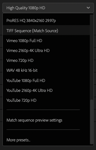
And since the latest version doesn’t remember your previous settings, like Match Sequence Settings, there are just more clicks needed.

The biggest problem with the thread is all the vitriol just makes Adobe shutdown and not care. And it doesn’t help that they put so much head to the beta test period, which not only was not very long, but is something that can be hard to do if you are in production.